This Jackson couple called the historic Belhaven neighborhood home for almost two decades. As they grew into a family of four, they thrived in the creative community and loved their home’s classic style. However, as their children matured and became more involved in school and church activities, they found themselves in need of a home that better suited their busy lives. While perusing the Eastover neighborhood in northeast Jackson, the couple discovered a home that had remained mostly untouched by its original owners. The Southern Colonial also projected a hint of Georgian and Federal styles.
It boasted a front porch—and once, even a putting green on the front lawn—and the home reminded the couple of the welcoming and classic elements they had enjoyed in their previous home. An added bonus was that the property was an easy two blocks from the family’s church and three miles from their children’s school.
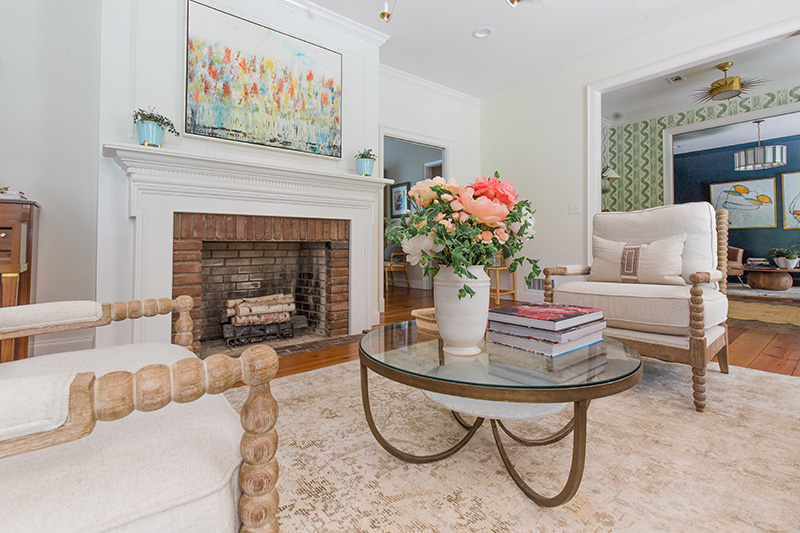
The original interior layout suited the family’s personality, and the homeowners could see their vision unfold upon their first visit. “Seeing the house for the first time, we loved the inviting front porch, then walking into the foyer—with its formal living room and dining rooms with heart of pine floors—it reminded us of our first Belhaven home,” the homeowner recalls. The home’s large windows and mature landscaping allowed natural light and color to fill the interiors.
Before purchase, the couple called upon interior designer Mary Clair Cumbaa of Cumbaa Design Company in Indianola and architectural designer Michael Thorne to brainstorm their needs and desires for a more functional and updated space “We knew we loved the house and could imagine our family there; we just needed someone to bring those ideas to life,” the homeowner notes. The couple knew they wanted a creative team that worked well together and had an established relationship, so they took Thorne’s recommendation and contacted builder Jonathan Becker of Quality Construction.
Immediately before the pandemic, Cumbaa had assisted the couple in updating several spaces in their Belhaven home. With a few minor changes, including lighting, fabrics, and rugs, Cumbaa transformed the look of the main living areas, allowing the family to appreciate their long days at home. The homeowners were certain that they wanted her involved in their new project.
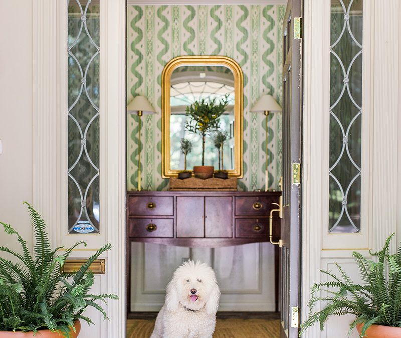
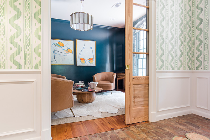
Embracing the classic façade and porch that stretches across the front, the designer added a pair of Bevolo gas lanterns and new, more substantial columns. She selected a trim color that coordinated with the home’s aged brick mortar. Cumbaa reconfigured the home’s layout by relocating door openings to improve the interior flow. Originally, the foyer’s double doors opened to the bedroom hallway, but by closing this space, she created a more formal entryway. The husband’s study is to the right of the foyer and can be closed by pocket doors. To the left is the living and dining room, which flows from the kitchen to the den and the children’s bedroom wing. The team then worked to establish a separate addition of a powder room, primary suite, and laundry space.
Cumbaa’s design signature is her ability to create spaces with the appropriate balance of old and new while maintaining an analogous feel. To start each project, the designer initiates a color palette to build upon. For this home, she began with a base of whites, golds, and rich woods, while building layers through bold blues and crisp greens. The selection of green as the interwoven color was pulled from the lush surroundings and an homage to the street name, Greentree. The designer and homeowner discussed the hue as the inspiration from the beginning. “I definitely chose this green color palette for the home, and I built everything off of the hue,” the designer notes. “Each paint color in the home has some kind of green undertone, which is why each space flows together beautifully.”
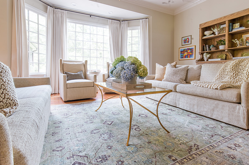
Also of importance was an inviting and warm ambiance. Utilizing the large windows was an effortless choice. “The natural light in the spaces project positive feelings and warmth, which is what people really crave,” the designer notes. “I really tried to capitalize on as much natural light in the home as possible, as well as the pleasing backyard views of the wooded area.” Highlighting areas near the windows by incorporating the appropriate furnishings and colors allows for as much natural light as possible. The addition, which includes the master suite, delivers the sensation of being in a treehouse. Certain windows were left uncovered to draw nature inside.
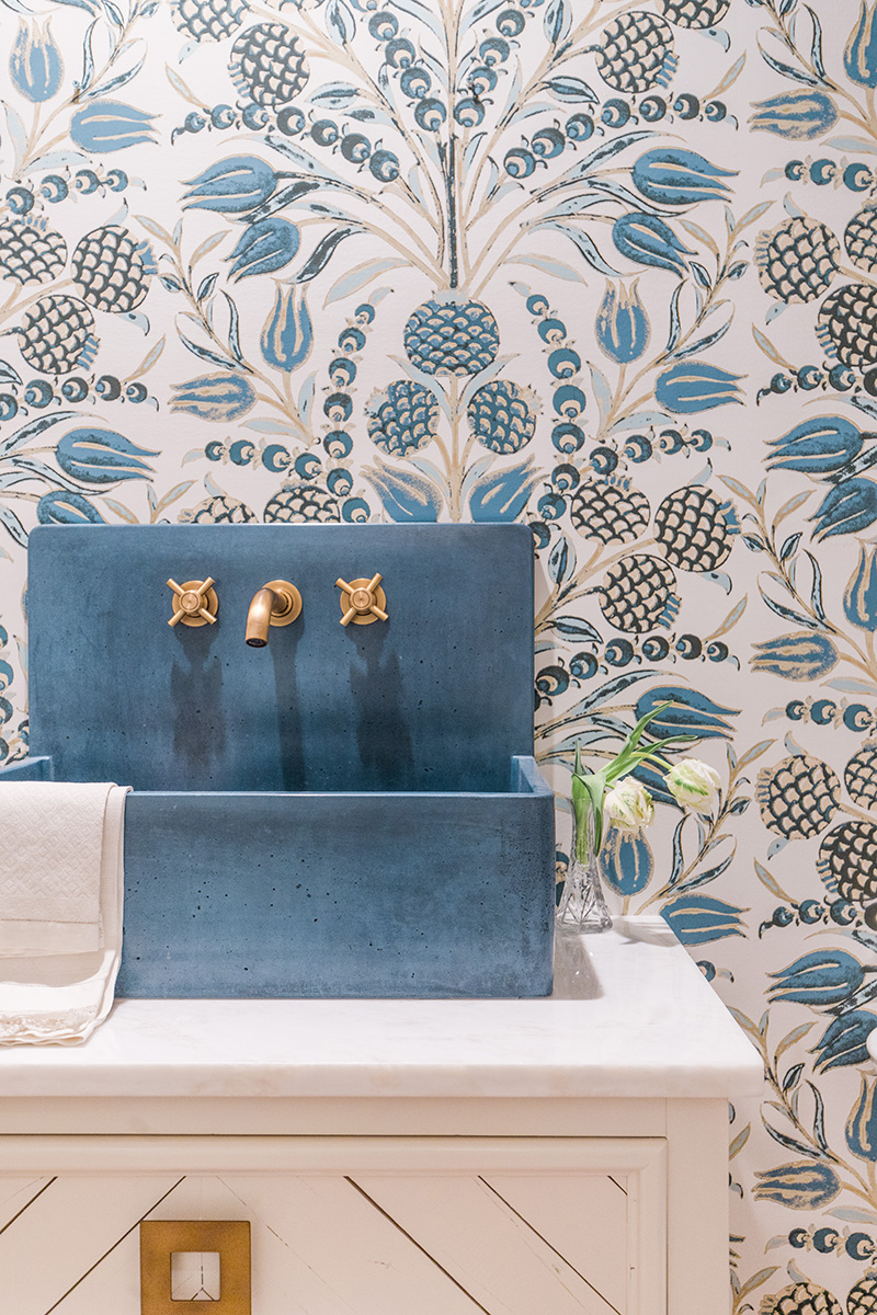
Cumbaa used numerous furnishings and accessories from the family’s previous homes to create a sense that the home was curated over decades. From a beautiful secretary of the husband’s grandmother that shines in the living room to the piano given to the couple by dear family friends and neighbors in Belhaven, each piece was thoughtfully placed in the new space. Modern lighting and hardware mingle well with the classic moldings and millwork, and Cumbaa’s application of patterned wallpapers adds to the updated feel. “The original owner of this home had beautiful wallpaper, and I wanted to modernize the aesthetic but keep with the idea,” adds the homeowner. The couple has also carefully accumulated a fantastic collection of art throughout their marriage and on their travels, and this also enhances the home’s customized style.
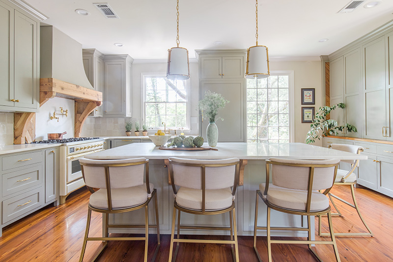
The family uses the kitchen most evenings, gathering for dinner at the island. “With teenagers, it is very hard to have all home at the same time. When we do have a meal there, we linger as long as time allows,” the homeowner adds.
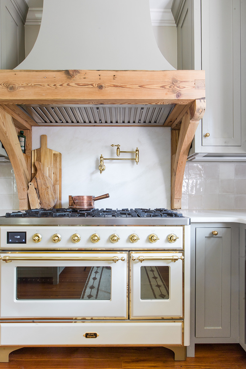
The desire was to have the kitchen feel more like a living space, allowing it to be the hub of the home while leading into the den or dining room as the occasion permits. Cumbaa chose twin pendants above the island, aware that good lighting is like jewelry. She feels they are sophisticated yet understated and showcase the surrounding space. The oversized range is the focal point and the key item on the family’s wish list, as the daughter maintains her own baking business. The lighting and hardware harmonize with replicating brass details of the range. Each zone is perfectly organized and suited for the family.
Today, the family could not imagine calling anywhere else home. Buying from the original owners and knowing their initial design and intentions allowed them to pay tribute to the people who built the home and raised their family there. “The house was unchanged for 60 years, and we hope our updates will last another 60 years,” the homeowner notes. “This was a very special home to them and their extended family, and it already is to us.” M

